Mastering Error Bars in Excel 2016 Charts. Error bars in Excel charts are vital to illustrate data variability effectively. Here’s a step-by-step guide on how to add and fine-tune these error bars to your charts:
Mastering Error Bars in Excel 2016 Charts
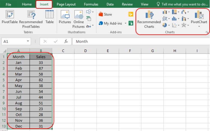
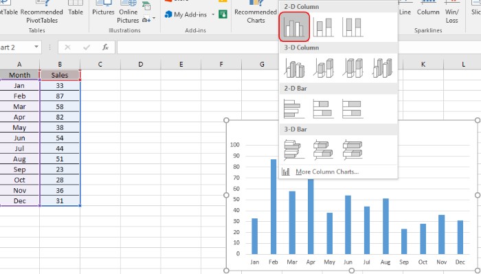
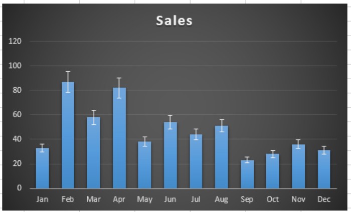
- Prepare Your Data: Organize your data and create a chart. Navigate to Insert > Charts, and select the 2-D Column chart for this walkthrough.
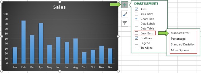
- Adding Error Bars: After setting up your chart, add error bars by clicking on the ‘+’ symbol at the chart’s top right.
 Choose the standard Error option and customize it using the Format Error bar feature.
- Customizing Error Bars: To further tailor the error bars, double-click on any of them.
 This action opens the Format Mastering Error Bars menu on the right side of your Excel sheet. Here, you can precisely adjust the type of customization and Error Amount method.
- Adjusting Variability: For instance, opt for a 10% variability in both positive and negative directions. Implementing this setting visually represents a 10% fluctuation in Sales across various months on your chart.
This process empowers you to vividly represent data deviations within your Excel 2016 charts. Explore additional insights on working with Charts and Graphs. Should you have any questions or need further assistance, feel free to ask in the comments section below. We’re here to help you master Excel!