How to Create XY Scatter Plots in Excel: A Comprehensive GuideIn this guide, we’ll delve into the art of plotting X vs Y data points in Excel, exploring the intricacies of scatter charts and their invaluable insights.
How to Create XY Scatter Plots in Excel: A Comprehensive Guide
A scatter chart, synonymous with create XY scatter Plots charts, serves as a powerful tool to decipher relationships between variables. By visually mapping data points, you gain an immediate grasp of correlations and trends, making it an indispensable asset in data analysis. In our tutorial, we’ll master the art of creating X vs Y plots, incorporating essential elements like axis labels, data points, and trendlines.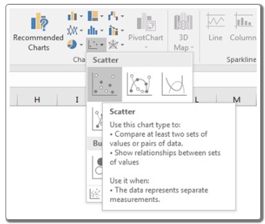
Create XY Scatter Plots: Unveiling the Process
To create a scatter plot in Excel, follow these straightforward steps:
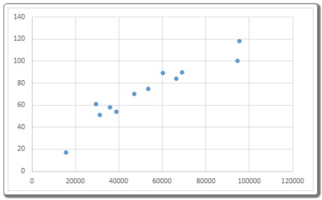
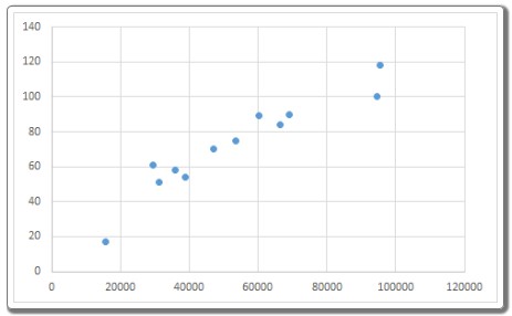
- Select Data Variables: Choose the variables you wish to analyze; for instance, Ad Cost and Sales data in cells B1:C13.
- Insert Scatter Chart: Navigate to Insert > Charts > Scatter > Select Scatter to generate the chart.
Your scatter plot is now ready, offering a clear visualization of the data’s relationship.
Create XY Scatter Plots: Adding Context and Trendlines
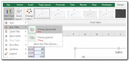
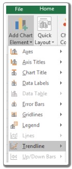
- Edit Axis Titles: To enhance clarity, label your axes. Select the scatter plot, go to the Design Tab, click on Add Chart Element, then select Primary Horizontal and Primary Vertical. Rename them as ‘Ad Cost’ and ‘Sales’ respectively.
Your chart gains depth, allowing viewers to interpret the data effortlessly.
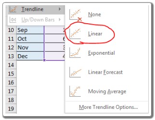
- Incorporating Trendlines: Trendlines provide predictive insights. To add one, select the scatter plot, go to Design Tab, click on Add Chart Elements, then Trendline > Linear. This overlays a trendline on your data points, aiding in forecasting future trends.
Your chart is now not just descriptive but also predictive, providing a comprehensive analysis of your variables.
Fine-Tuning the Scatter Chart: Design Elements and Observational Notes
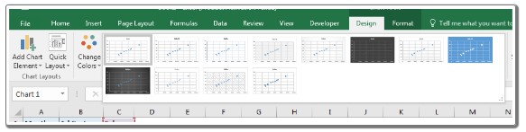
- Chart Styles: Explore various chart styles under the ‘Designs’ tab. Choose the one that best complements your data narrative, enhancing visual appeal.
- Adjusting Intercepts: Excel allows you to modify the intercept on the scatter chart. Above the displayed equation, find the ‘Set Intercept’ option. Activate this to manually tweak the intercept, tailoring the chart to specific requirements.

Observational Notes and Excel Functionality:
- Equations, intercepts, and slopes can be added to enrich your plot, ensuring clarity.
- Delve deeper into scatter plots and other Excel chart types for a more comprehensive understanding.
This guide equips you with the skills to create impactful X vs Y plots, enriching your data analysis toolkit. For more Excel insights, explore our array of articles covering diverse calculations and Excel formulas. Happy charting!