The Excel bubble charts is an enhanced version of the traditional scatter chart, offering an additional dimension to your data visualization. In this chart, the size of the bubbles represents a numeric value, allowing for a more in-depth analysis. Larger bubbles signify larger values, making it a powerful tool for displaying intricate data relationships.
Mastering Excel Bubble Charts: A Comprehensive Guide
Creating a Bubble Chart in Excel: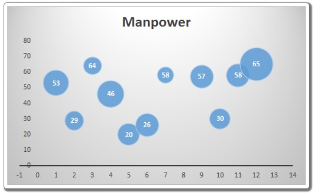
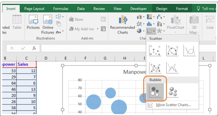
- Select Your Data: Begin by choosing the data you want to visualize. Typically, this includes three sets of data: one for the x-axis (months in this example), one for the y-axis (manpower), and one for bubble size (sales).
- Insert a Bubble Chart: Navigate to “Insert” => “Charts” => “Scatter Charts” => “Bubble Chart.” Excel will generate the chart based on your selected data, creating a visual representation with bubbles of varying sizes.
Interpreting the Bubble Chart: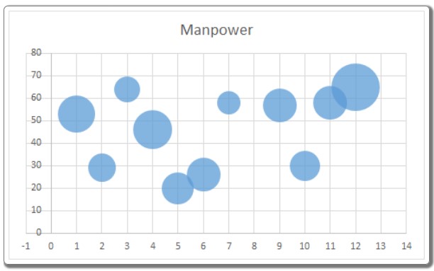
In the generated chart:
- X-Axis (Months): Represents the time intervals, often displayed in default intervals of two months. Adjustable to a one-month interval from the axis options.
- Y-Axis (Manpower): Displays the manpower used during each month. The chart’s vertical positioning indicates the manpower utilized, with higher positions denoting increased manpower.
- Bubble Size (Sales): Reflects the sales data. Larger bubbles signify higher sales figures, offering an immediate visual cue regarding the sales performance for each month.
Benefits and Best Practices:
- Ideal for Three Dimensions: Bubble charts excel at visualizing data with three dimensions, providing a clear understanding of relationships between multiple variables.
- Immediate User Engagement: The visual appeal of bubble charts captures users’ attention instantly, enhancing the understanding of complex data patterns.
Challenges and Considerations:
- Requires Explanation: First-time users may find bubble charts confusing initially. Clear explanations are essential to ensure comprehension.
- Avoid Overcomplication: Incorporating too many variables can clutter the chart, making it difficult to decipher. Exercise restraint to maintain clarity.
- Data Label Challenges: While adding data labels was challenging in earlier Excel versions, newer versions, starting from Excel 2013, have simplified this process.
In conclusion, mastering the art of bubble charts in Excel empowers you to create visually compelling representations of multidimensional data. If you have any questions about this guide or any other Excel/VBA-related topics, feel free to ask in the comments section below. Your understanding is our priority!