In Effectively Utilize Treemap Charts in Excel 2016, Microsoft introduced two hierarchical chart types: the Sunburst chart and the Treemap chart. In this guide, we’ll focus on the Treemap chart and explore when and how to use it effectively.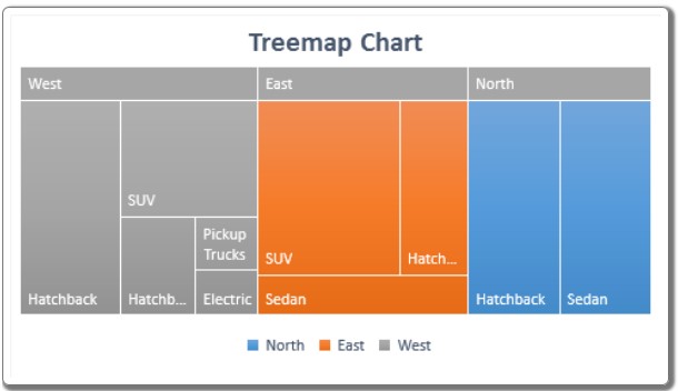
How to Effectively Utilize Treemap Charts in Excel 2016
Understanding Treemap Charts: Effectively Utilize Treemap Charts in Excel 2016
A Treemap chart displays rectangles of varying sizes and colors. The color of each rectangle signifies a supergroup, while the size represents the percentage of the total supergroup. For instance, if the color blue represents the region “North,” all blue rectangles encompass the entire dataset for the North region. If North has an equal number of sedan and hatchback cars, both types will be represented by equally sized blue rectangles.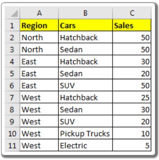
Example: Creating a Treemap Chart in Excel:
Let’s consider a sample dataset detailing car sales in different regions of a country: North, East, and West. We have various car types such as hatchbacks, sedans, and SUVs. Here’s how you can create a Treemap chart:
- Select Data: Highlight your dataset.
- Insert a Treemap Chart: Navigate to “Insert” -> “Hierarchy Chart” -> “Treemap.”
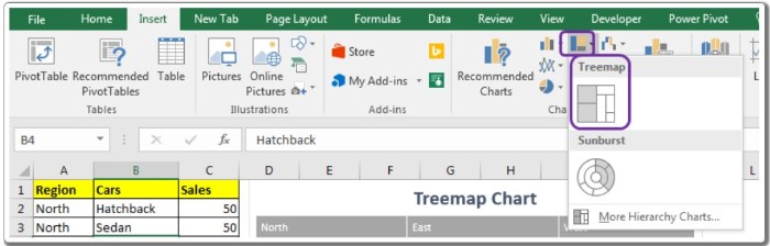
- Customize the Chart: Click on the Treemap chart option to generate your hierarchical chart.
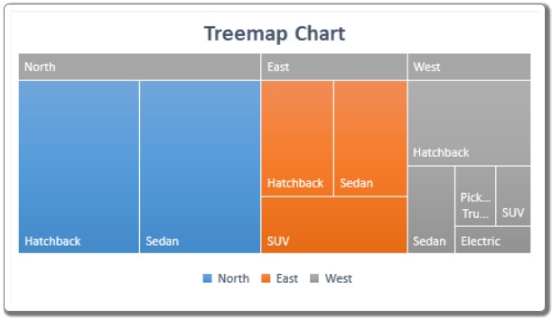
Interpreting the Treemap Chart:
In the resulting chart, each color corresponds to a distinct group, as indicated in the legends. For instance, blue represents North, orange represents East, and grey represents West. The size of each box within a color signifies the share it holds within that region.
When to Use Treemap Charts:
- Utilize Treemap diagrams when visualizing hierarchical data with several categories and subcategories.
- Treemaps make efficient use of available chart space.
Important Considerations:
- Avoid Extreme Variances: Do not use Treemap charts for categories with significant variances. Smaller categories might become difficult to discern on the diagram.
- Complex Categories: A multitude of categories and hierarchical levels can lead to confusion.
Adopting Treemap charts in Excel might seem daunting initially, but once you become familiar with their functionality, you’ll appreciate their effectiveness in visualizing intricate data hierarchies. If you have any questions or specific requirements, feel free to share them in the comments section below.