Exploring the Excel Area Char. Microsoft Excel offers a diverse range of chart types, such as Column, Bar, Pie, and Line. Among these, the Excel Area chart is a lesser-known gem that can be incredibly insightful. In this article, we will delve into the world of Excel Area Charts.
The Excel area chart is essentially a variation of the line chart, but with a visually appealing twist—it fills the area below the line with a chosen color, making it ideal for illustrating trends over time. Surprisingly, this chart type isn’t readily visible on the ribbon tab; instead, you can find it under the Line chart category.
Example 1: Plotting an Excel Area Chart for Two Groups
Consider a scenario where you have data depicting the area covered by two groups during different months. By visualizing this data using an Excel area chart, you can easily compare their performance over time.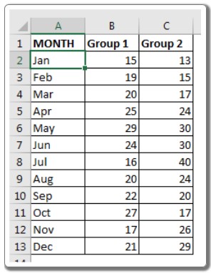
To Create the Excel Area Chart:
- Select the prepared data.
- Navigate to the Insert tab, click on Chart, then go to Recommended Chart.
- Choose All Charts and select Area Chart.
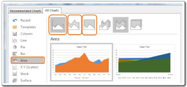
- From the available options, pick the standard Area Chart type.
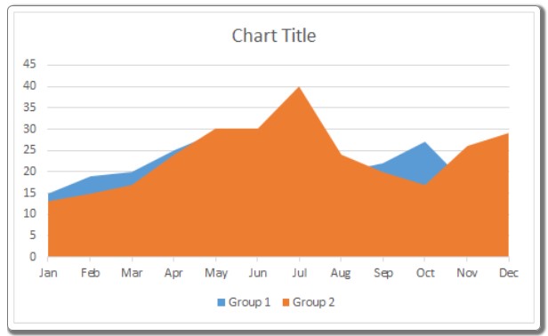
Interpretation:
Upon examining the chart, you can observe that Group 2 consistently covers more area than Group 1. The blue area indicates months where Group 1 outperforms Group 2. Although direct comparison is challenging, this visualization highlights the relative performance of the two groups each month.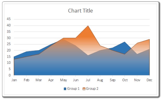
Example 2: Creating a Stacked Area Chart
In situations where each group conducts surveys in distinct areas, a Stacked Excel Area Chart proves invaluable. It showcases the combined area covered by both groups, aiding in understanding the overall coverage.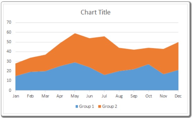
Interpreting the Stacked Area Chart:
The chart represents the total area covered by both groups. For instance, in January, Group 1 covers 15 units (displayed in blue from 0 to 15), and Group 2 covers 13 units (from 15 to 28), resulting in a total coverage of 28 units in January (from 0 to 28).
Example 3: Utilizing a 100% Stacked Area Chart
If you need to visualize the percentage contribution of each group to the total area covered, the 100% Stacked Area Chart is the go-to choice.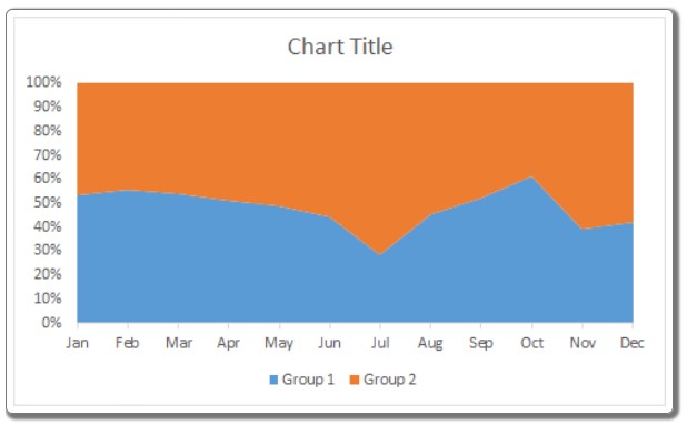
Interpreting the 100% Stacked Area Chart:
This chart displays the entire area as 100%, with the blue portion representing the percentage covered by Group 1. In January, Group 1 covers 54% of the available area, leaving the remaining 46% to be covered by Group 2.
Best Uses of Stacked Charts:
- Highlighting Best Performances: Opt for a stacked chart when you want to emphasize the best points within a specific time interval.
- Understanding Cumulative Impact: Stacked charts are ideal for assessing the cumulative impact of multiple groups or individuals’ efforts.
- Analyzing Parts of a Whole: Use 100% stacked charts when you need to comprehend the contribution of each group or individual to a specified task.
Avoid Using Stacked Charts When:
- You have an excessive number of variables.
- You need to compare just two specific data points.
In conclusion, area charts in Excel offer a powerful way to visualize data trends and comparisons. If you have any questions or specific requirements, feel free to share them in the comments section below. Happy charting!